- UX Rescue · Mobile App
- Arab National Bank · Riyadh
- 2020 – 2023
- OutSystems · iOS · Android
ANB Mobile
Rescuing a fully-built but unusable banking app — redesigning the entire UX from scratch, shipping just in time for Covid-19 to make mobile banking essential for 2 million customers.
- Industry awards won post-launch
- 5
- ANB customers served via the app
- 2M+
- App stores launched: iOS + Android
- 2
Before
A finished app nobody could use
More than a year of development, technically complete — and a UX so confusing the bank considered scrapping it.
The rebuild
Rebuilt around how people bank
Information architecture redesigned from scratch: the most-used actions on the home screen, everything else one step away.
After
Shipped into a pandemic
Launched on the App Store and Google Play months after lockdowns began. Five industry awards followed.
A year of development. A finished app. And a UX so broken the bank considered scrapping it entirely.
In 2019, the Saudi government was deep into its Vision 2030 digital transformation agenda — and banking was at the centre of it. The directive was unambiguous: every account-related function must be available through digital channels, with mobile as the priority. Physical branch interactions for routine banking were to become the exception, not the norm.
Arab National Bank responded by launching an in-house mobile app development project on the OutSystems platform — a technology that was new to the development team at the time. After more than a year of work, the technical build was complete. But when users tried to use it, the experience was so confusing and cluttered that the app was functionally useless. Customers couldn’t find what they needed. Simple tasks required navigating through layers of poorly organised menus. The app was causing more frustration than it solved.
The brief
"Fix the UX so the app can actually be used — rather than being scrapped in full."
Saudi Vision 2030 required all banks to achieve full digital-channel parity. No core banking function could remain branch-only. Mobile was the stated priority channel.
Dozens of functions crammed into an undifferentiated interface with no clear hierarchy. Users were abandoning the app mid-task and calling customer care instead — the exact problem it was built to prevent.
Over a year of development investment and the bank’s entire digital transformation credibility. A scrapped app would have meant starting over — with no guarantee the second attempt would be any better.
Unknown at the time: a global pandemic was months away. The need for a working mobile banking app was about to become not just a strategic priority — but an essential public service.
Understanding every failure point before changing a single screen
Rather than immediately redesigning screens, I started with structured research across the product, the business, and the competitive landscape. The existing app had real users and real failure patterns — the data was already there, it just needed to be surfaced and understood.
- 01Function-by-function pain point mapping
I ran research sessions for each core banking function — transfers, account management, card services, payments — documenting exactly where users were getting lost, what they expected to find and where, and which tasks were being abandoned entirely. This gave me a ranked list of the highest-impact UX failures to address first.
- 02Business requirements sessions
Worked with the business team to understand which functions the bank needed customers to adopt most urgently, what compliance constraints shaped certain screens, and where the business had previously made UX compromises to meet technical deadlines. This context was essential for knowing which design decisions had room to move and which didn’t.
- 03Competitor benchmarking
Analysed the mobile banking apps of leading regional and international banks — studying how they structured information architecture, handled onboarding, and surfaced the most-used functions. This established a benchmark for what Saudi banking customers already expected from a mobile app, not what we assumed they expected.
- 04Information architecture redesign
Rebuilt the app’s navigation structure from scratch — reducing cognitive load by grouping related functions, surfacing the most-used actions on the home screen, and removing the clutter of secondary features from primary navigation paths. Prototyped and validated the new structure with stakeholders before moving into OutSystems development.
- 05Agile delivery on OutSystems
Worked within an Agile sprint methodology — designing, building, and iterating in cycles. As one of the few team members proficient in both OutSystems development and UX design, I bridged the gap between what was designed and what was actually shipped, preventing the design-to-development degradation that had undermined the original app.
A self-explanatory experience that guides users to their goal — without confusion, without calling support
The core design principle was deceptively simple: every user should be able to find any function without asking for help. Not a power-user feature. Not a tutorial. Just a structure clear enough that the right path was always obvious.
This meant ruthlessly prioritising the most common tasks — transfers, balance checks, card management — and making them immediately accessible from the home screen. It meant reducing the number of decisions required to complete each journey. And it meant designing for the specific context of mobile banking in Saudi Arabia: users who might be completing transactions on the go, in Arabic or English, across a range of devices and network conditions.
Before
A stack of cards you had to open
The original home screen put every account in a card stack, with "click on card for details" as the only way in.
Redesign
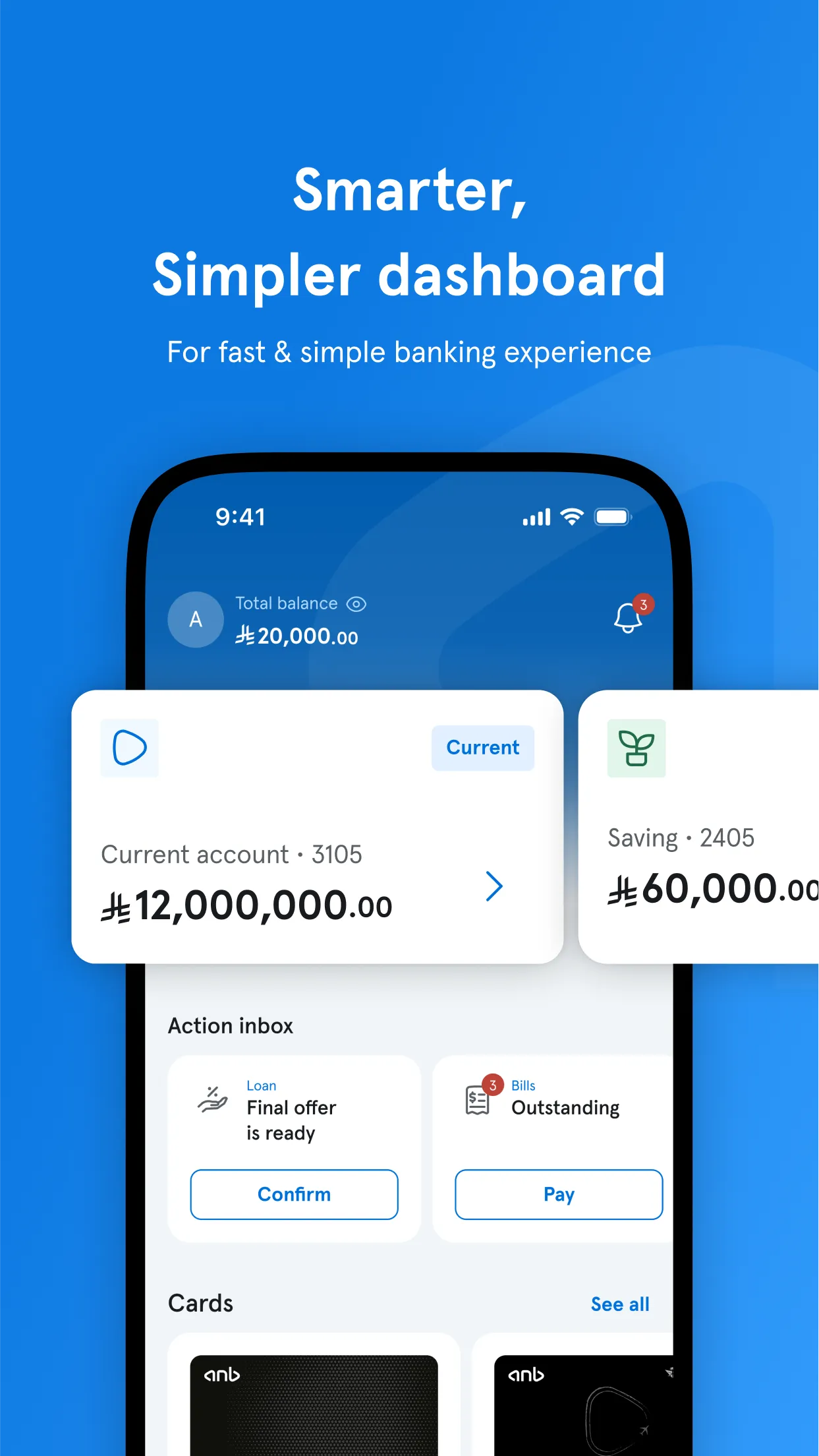
Balance first, actions within reach
One account up front, quick actions beneath it, transactions below, and a persistent bottom bar for transfers, bills and products.
Redesign · v2
Cards in a carousel, same quick actions
The next iteration brought the cards back as a swipeable carousel while keeping the quick actions and transactions where people expect them.
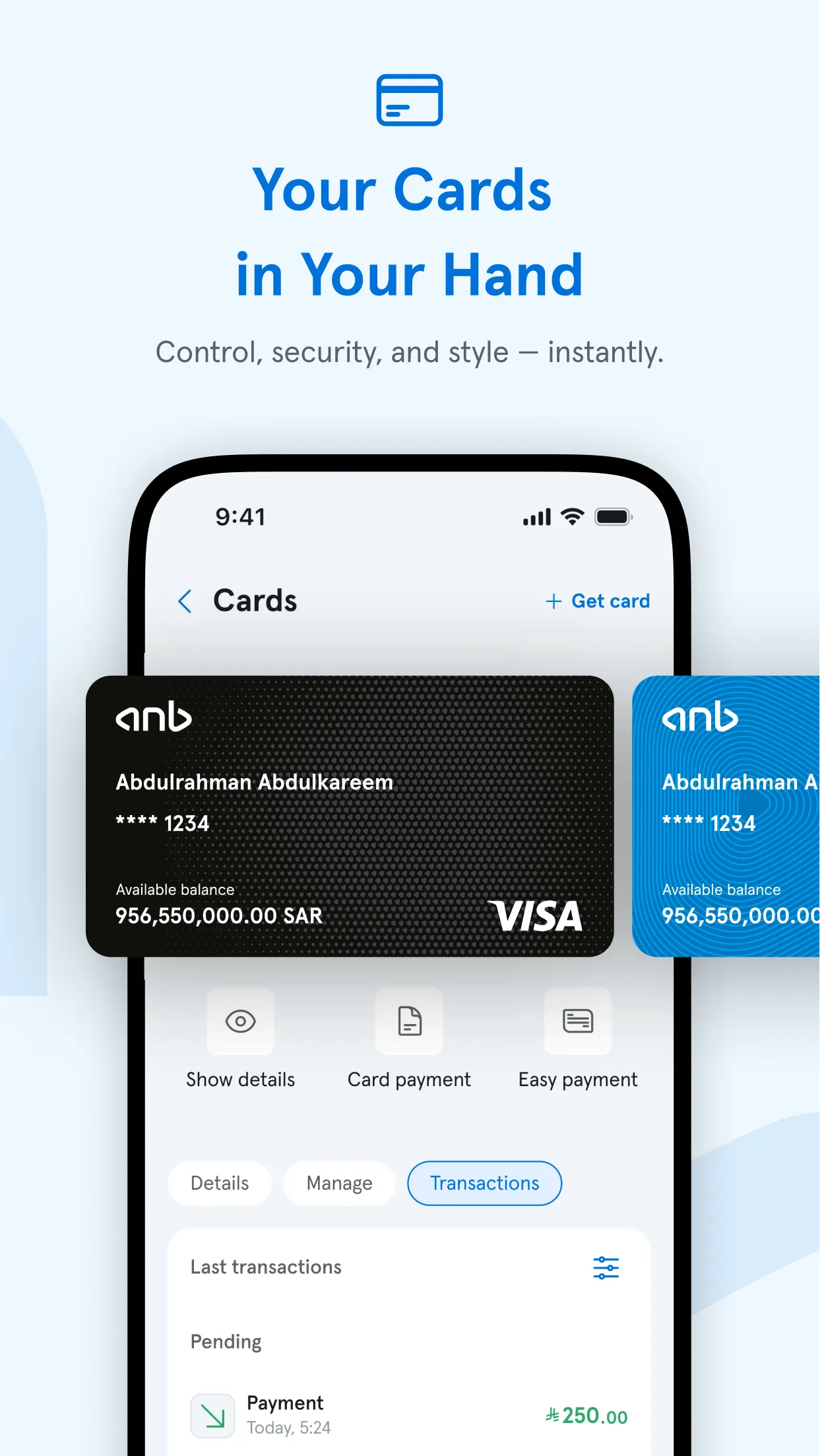
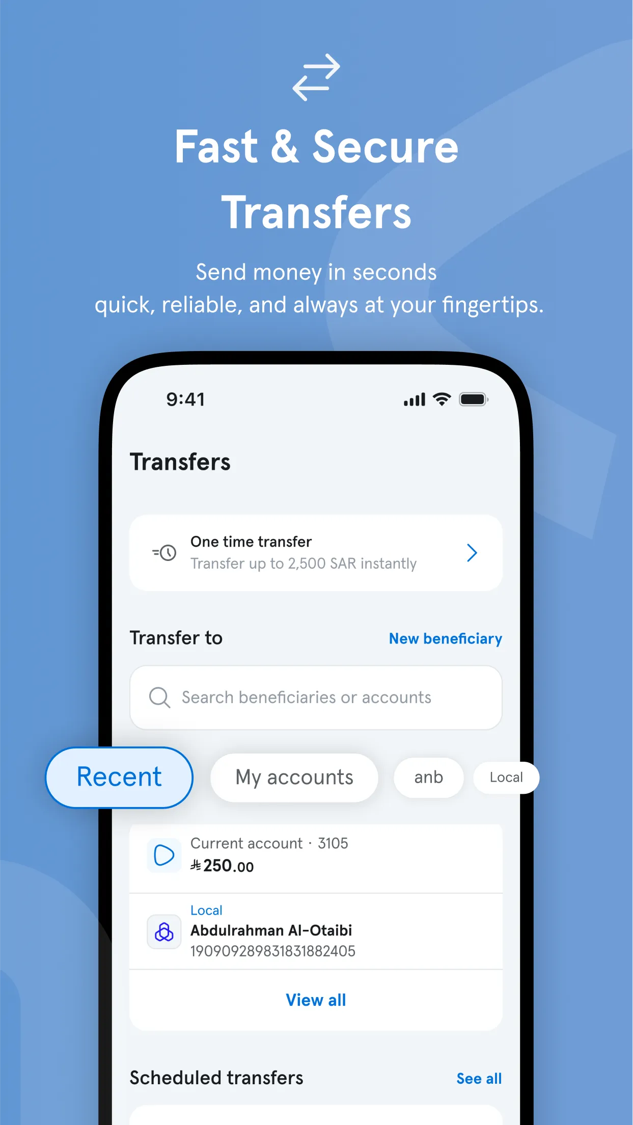
- Restructured information architecture — functions reorganised from a flat, overwhelming list into logical groups that matched how users actually think about their banking, not how the bank’s internal systems were organised.
- Home screen quick actions — the five most-used functions surfaced directly on the home screen, reducing the average number of taps to complete a common task from six or more to two or three.
- Progressive disclosure — advanced features and less-common functions moved to secondary navigation, keeping the primary experience clean without removing functionality that power users needed.
- Guided transaction flows — multi-step processes like transfers and card applications redesigned as clear, step-by-step journeys with explicit progress indicators — eliminating the ambiguity that was causing users to abandon tasks mid-flow.
- Biometric authentication — seamless Face ID and fingerprint login replacing the friction of manual password entry, reducing the barrier to using the app daily.
- SVG animations and micro-interactions — custom motion design for transaction confirmations, loading states, and onboarding — making the app feel responsive and considered rather than static and institutional.
- OutSystems
- Progressive Web App
- HTML5 / CSS3
- JavaScript
- Node JS
- Cordova
- Framework 7
- SVG Animation
- Adobe Creative Cloud
- InVision
- iOS App Store
- Google Play
Shipped into a pandemic. Used by millions. Recognised by five industry bodies.
The new UX was nearly complete when Covid-19 arrived and Saudi Arabia — along with the rest of the world — went into lockdown. Physical bank branches closed or severely restricted access overnight. Mobile banking shifted from a convenience to a necessity in the space of days.
The timing that couldn’t have been planned
"We were already very close to finishing the new UX when Covid struck. We delivered it into a world where it was suddenly the only way millions of customers could access their bank at all."
The app launched on both the App Store and Google Play to an overwhelmingly positive public response. For a bank whose internet banking had been optimised for desktop PC use, the mobile app became the primary digital channel almost immediately. Customer care volume for routine banking tasks dropped significantly as users discovered they could complete transactions themselves — on their phones, at any time, without waiting.
- Active customers on the platform
- 2M+
- Industry awards in the year following launch
- 5
- Best Mobile Banking App, Saudi Arabia — Global Finance 2021
- #1
Awards
- 2021Best Mobile Banking App — Saudi ArabiaGlobal Finance Magazine
- 2022Best Mobile Application — Saudi ArabiaInternational Business Magazine
- 2022Best SME Banking — Saudi ArabiaInternational Business Magazine
- 2021–2022Mobile Excellence AwardOutSystems Saudi Arabia Summit
- 2021Best Digital Bank — Saudi ArabiaDigital Banker Awards
Full award details: outsystems.com/case-studies/anb-mobile-banking-app
Project timeline
- 2019Original app built1+ year in development. Technically complete but UX unusable.
- Early 2020Kamran joinsHired specifically to rescue and redesign the UX.
- March 2020Covid-19 lockdownsMobile banking becomes critical infrastructure overnight.
- Late 2020New UX shipsLaunched on App Store and Google Play to strong public response.
- 2021–225 awardsIndustry recognition across Global Finance, IBMag, OutSystems.
What I learned
Key learning
The most important lesson from this project was about the difference between building features and building clarity. The original app had the same features as the redesigned one — every function was there. What was missing was a structure that let users find them. The entire UX problem was an information architecture problem, not a visual design problem.
The second lesson was about timing and context. No amount of planning could have anticipated that a mobile banking app completed in early 2020 would immediately become essential infrastructure for millions of people. It reinforced how much the impact of a product depends on the moment it meets the world — and why shipping a working, well-considered experience is always better than shipping something perfect too late.
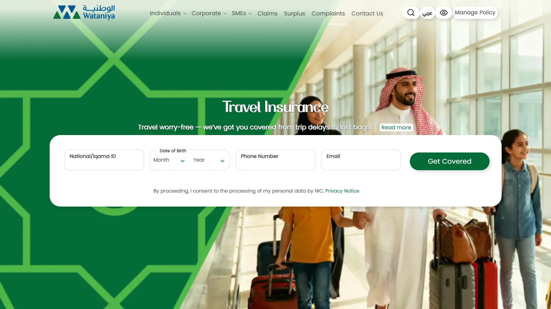
Next case study
Wataniya Self-Service Portal
A 24/7 self-service portal and native iOS and Android apps that freed two overloaded departments from routine policy changes.
View project →